I read into causal inference recently and since I didn’t really have a use-case for it right now, I played around with some data and some causal graphs. In this article, I looked at some causal graphs from the “Book of Why” Chapter 4 by Judea Pearl and Dana Mackenzie and created simulated data based of them. On this data, I tested the back-door criterion to see how it feels and to show what can go wrong with false assumptions.
Whats the back-door criterion and why do we need it?
In classical regression analysis, we usually want to control for some observed variables to take their effect out of the effect we want to estimate. For example, you might want to remove the effect of age from your analysis if caffeine improves memory recall. But using the “wrong” control variables can cause your analysis to go bad. Usually it’s hard to tell when it’s save or even necessary to control for a specific variable. The back-door criterion offers a rule there.
To deconfound two variables $X$ and $Y$, we need only block every noncausal path between them without blocking or perturbing any causal paths. More precisely, a back-door path is any path from $X$ to $Y$ that starts with an arrow pointing into $X$. $X$ and $Y$ will be deconfounded if we block every back-door path. By blocking, we usually mean controlling for that variable in the regression.
Some examples from the “Book of Why”
Let’s look at some examples from the book and how they look with numbers.
import numpy as np
from scipy import stats
import matplotlib.pyplot as plt
import statsmodels.api as sm
import statsmodels.formula.api as smf
import pandas as pd

N = 1000
Example 1
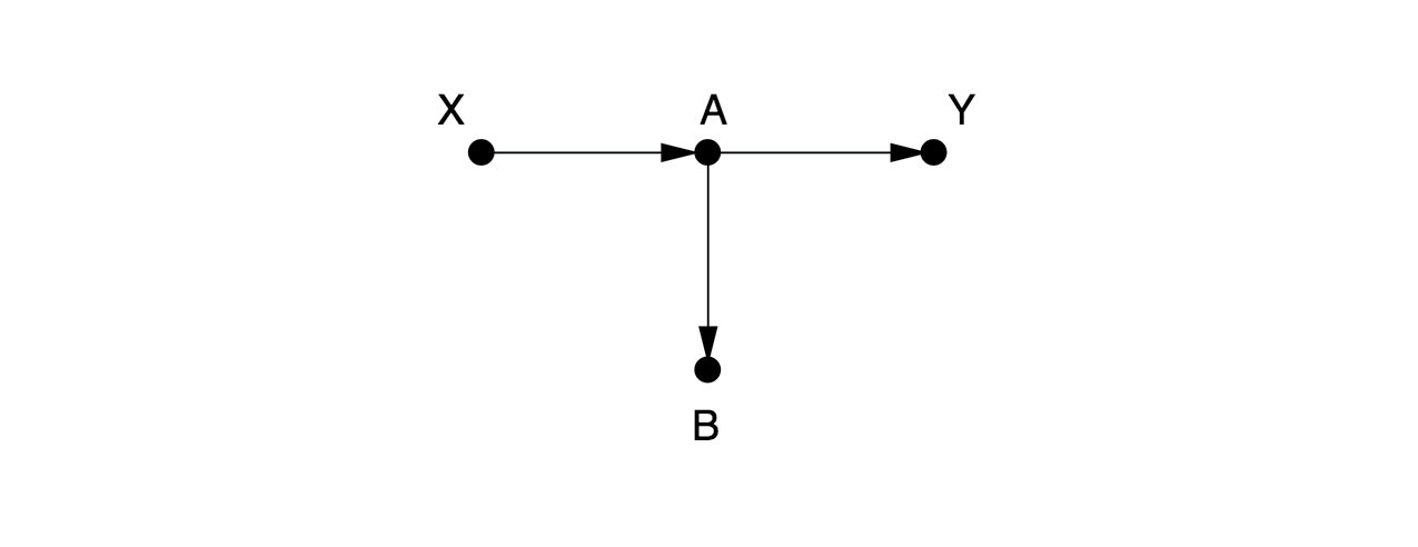
Here, there are no arrows leading into $X$, so there are no back-door paths. We don’t need to control for anything. Someone might think it is a good idea to control for $B$ here. But that would be a mistake, since it would close the causal path from $X$ to $Y$.
Hypothesis: Controlling for $B$ is bad
First we simulate the variable according to the causal graph using scipy.stats.
# simulate the variables
X = stats.norm.rvs(loc=0, scale=2, size=N)
A = ( X + 2 ) / 3
Y = A * stats.norm.rvs(loc=2, scale=2, size=N)
B = 2 * A

data = pd.DataFrame({"X": X, "A": A, "Y": Y, "B": B})
# calculate a regression
# Y ~ X
results = smf.ols('Y ~ X', data=data).fit()
print(results.summary().tables[1])
                 coef    std err          t      P>|t|      [0.025      0.975]
------------------------------------------------------------------------------
Intercept      1.3739      0.058     23.689      0.000       1.260       1.488
X              0.7411      0.030     24.737      0.000       0.682       0.800
Here, we see $X$ has a clear effect ($0.74$) on $Y$. Now, let’s look what happens when we correct for $B$.
# now correct for B
# Y ~ X + B
results = smf.ols('Y ~ X + B', data=data).fit()
print(results.summary().tables[1])
                 coef    std err          t      P>|t|      [0.025      0.975]
------------------------------------------------------------------------------
Intercept      0.4114      0.027     15.192      0.000       0.358       0.465
X              0.2599      0.030      8.652      0.000       0.201       0.319
B              0.7219      0.025     28.949      0.000       0.673       0.771
Now we estimate, that $B$ has an effect on $Y$, even though it clearly hasn’t.
Example 2
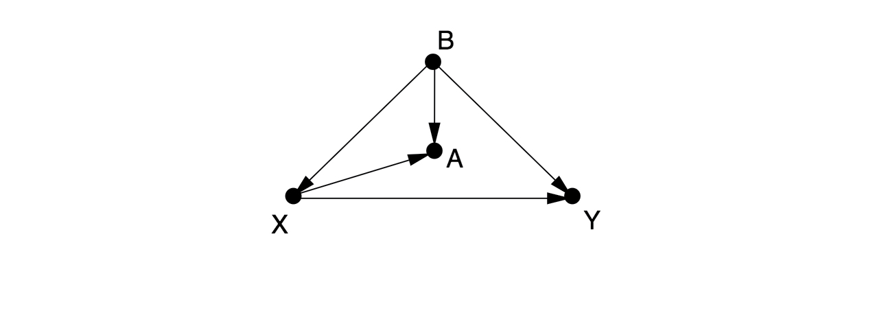
There is one back-door path from $X$ to $Y$, $X \leftarrow B \rightarrow Y$, which can only be blocked by controlling for $B$. If we cannot observe $B$, then there is no way to estimate the effect of $X$ on $Y$ without running a randomized controlled experiment. Some people would control for $A$, as a proxy variable for $B$, but this only partially eliminates the confounding bias and introduces a new collider bias.
# simulate the variables
N = 1000
B = stats.norm.rvs(loc=0, scale=5, size=N)
X = B + stats.norm.rvs(loc=2, scale=1, size=N)
A = X + B
Y = X * B

data = pd.DataFrame({"A": A, "B": B, "X": X, "Y": Y})
# calculate a regression
# Y ~ X
results = smf.ols('Y ~ X', data=data).fit()
print(results.summary().tables[1])
                 coef    std err          t      P>|t|      [0.025      0.975]
------------------------------------------------------------------------------
Intercept     23.2653      1.119     20.783      0.000      21.069      25.462
X              1.3739      0.204      6.750      0.000       0.974       1.773
# calculate a regression
# correct for B
# Y ~ X + B
results = smf.ols('Y ~ X + B', data=data).fit()
print(results.summary().tables[1])
                 coef    std err          t      P>|t|      [0.025      0.975]
------------------------------------------------------------------------------
Intercept     27.4774      2.332     11.784      0.000      22.902      32.053
X             -0.7484      1.051     -0.712      0.477      -2.811       1.314
B              2.2077      1.073      2.058      0.040       0.103       4.313
# calculate a regression
# correct for A
# Y ~ X + A
results = smf.ols('Y ~ X + A', data=data).fit()
print(results.summary().tables[1])
                 coef    std err          t      P>|t|      [0.025      0.975]
------------------------------------------------------------------------------
Intercept     27.4774      2.332     11.784      0.000      22.902      32.053
X             -2.9561      2.114     -1.399      0.162      -7.104       1.191
A              2.2077      1.073      2.058      0.040       0.103       4.313
Examples of confounding
Here we look at some examples of confounding and how they play out in the numbers.
Example: Common cause
We first consider the following causal graph:
Smoking --> Lung cancer
   /
  /
 v
Carrying
a Lighter
smoking = stats.norm.rvs(loc=10, scale=2, size=N)
cancer  = smoking + stats.norm.rvs(loc=0, scale=1, size=N)
lighter = smoking + stats.norm.rvs(loc=0, scale=1, size=N)
data = pd.DataFrame({"cancer": cancer, "smoking": smoking, "lighter": lighter})

results = smf.ols('cancer ~ lighter', data=data).fit()
print(results.summary().tables[1])
                 coef    std err          t      P>|t|      [0.025      0.975]
------------------------------------------------------------------------------
Intercept      1.7610      0.203      8.684      0.000       1.363       2.159
lighter        0.8266      0.020     41.816      0.000       0.788       0.865
So the numbers show a spurious association between “Carrying a lighter” and “Lung cancer”, but now when we condition on “Smoking”:
results = smf.ols('cancer ~ lighter + smoking', data=data).fit()
print(results.summary().tables[1])
                 coef    std err          t      P>|t|      [0.025      0.975]
------------------------------------------------------------------------------
Intercept     -0.1669      0.169     -0.989      0.323      -0.498       0.164
lighter        0.0184      0.033      0.557      0.578      -0.047       0.083
smoking        1.0003      0.037     27.349      0.000       0.929       1.072
We see, that the effect of “Carry a lighter” disappears. This is because correcting for “Smoking” closes the back-door path in the graph.
Example: Mediator
We consider the following causal graph:
SelfEsteem --> Happiness
    ^          ^
     \        /
      \      /
      Grades
grades = stats.norm.rvs(loc=10, scale=2, size=N)
selfesteem  = grades + stats.norm.rvs(loc=0, scale=1, size=N)
happines = grades + selfesteem + stats.norm.rvs(loc=0, scale=1, size=N)
data = pd.DataFrame({"grades": grades, "selfesteem": selfesteem, "happines": happines})

results = smf.ols('happines ~ grades', data=data).fit()
print(results.summary().tables[1])
                 coef    std err          t      P>|t|      [0.025      0.975]
------------------------------------------------------------------------------
Intercept      0.0484      0.219      0.221      0.825      -0.381       0.478
grades         2.0011      0.021     93.102      0.000       1.959       2.043
So the total effect should be 2 since “happiness” is “grades” plus two standard normal distributions here. And we see it indeed is. But if we now condition on self esteem:
# condition on self-esteem
results = smf.ols('happines ~ grades + selfesteem', data=data).fit()
print(results.summary().tables[1])
                 coef    std err          t      P>|t|      [0.025      0.975]
------------------------------------------------------------------------------
Intercept      0.0967      0.155      0.622      0.534      -0.208       0.402
grades         0.9870      0.036     27.619      0.000       0.917       1.057
selfesteem     1.0061      0.032     31.380      0.000       0.943       1.069
Now only the direct effect for grades is estimated, due to blocking the indirect effect by conditioning on the mediator self-esteem. Note, that in this graph we had no back-door paths.
Example: Collider Bias
X --> C
     ^
    /
   Y
Here, there is no causal path between $X$ and $Y$. However, both cause $C$, the collider. If we condition on $C$, we will invoke collider bias by opening up the (non causal) path between $X$, and $Y$.
X = stats.norm.rvs(loc=10, scale=2, size=N)
Y = stats.norm.rvs(loc=15, scale=3, size=N)
C = X + Y + stats.norm.rvs(loc=0, scale=1, size=N)
data = pd.DataFrame({"X": X, "Y": Y, "C": C})

# X and Y are independent so we should find no association:
results = smf.ols('X ~ Y', data=data).fit()
print(results.summary().tables[1])
                 coef    std err          t      P>|t|      [0.025      0.975]
------------------------------------------------------------------------------
Intercept      9.6434      0.340     28.372      0.000       8.976      10.310
Y              0.0236      0.022      1.053      0.293      -0.020       0.068
So as expected, there is no association between $X$ and $Y$. But if we now condition on $C$ we create a spurious association between $X$ and $Y$.
results = smf.ols('X ~ Y + C', data=data).fit()
print(results.summary().tables[1])
                 coef    std err          t      P>|t|      [0.025      0.975]
------------------------------------------------------------------------------
Intercept      1.7734      0.197      9.001      0.000       1.387       2.160
Y             -0.7970      0.016    -48.469      0.000      -0.829      -0.765
C              0.8069      0.013     63.003      0.000       0.782       0.832
Summary
We saw how some causal graphs look like and how the numbers play out with some simulated data. I hope this gives you a better understanding of whats going on in causal inference. Let me know if it helped you! I can highly recommend the “Book of Why”.
Further reading
- “Book of Why” by Judea Pearl and Dana Mackenzie
- https://stats.stackexchange.com/questions/482991/how-do-i-treat-my-confounding-variables-in-my-multivariate-linear-mixed-model
- https://stats.stackexchange.com/questions/445578/how-do-dags-help-to-reduce-bias-in-causal-inference/445606#445606